The HubSpot Data Model: A Complete Guide for Admins and RevOps Teams
The Complete Guide to HubSpot Reporting: Dashboards, Custom Reports, and Attribution
Thorstein Nordby
|
31 minutter

Your HubSpot portal is sitting on a goldmine of customer data — but if your team is still relying on default dashboards and spreadsheet exports, most of that data never turns into a decision.
The gap between "we have HubSpot" and "we actually use HubSpot reporting" is where pipeline leaks go unnoticed, marketing spend gets misallocated, and sales leaders fly blind on forecast accuracy.
This guide closes that gap. It covers every report type, walks through the Custom Report Builder step by step, breaks down attribution models, and shows you exactly which reports to build across marketing, sales, and service — so your team stops guessing and starts making decisions backed by data they trust.
- Why Most HubSpot Portals Underuse Reporting
- The HubSpot Reporting Ecosystem — Three Layers, One Data Source
- HubSpot Report Types — And When to Use Each One
- The Custom Report Builder — A Practical Walkthrough
- Multi-Object Reporting, Data Models, and Datasets
- HubSpot Attribution Reporting — From First Touch to Revenue
- Reports Worth Building Across Every Hub
- Operations and Data Quality Reports
- HubSpot Dashboards That Actually Get Used
- Common HubSpot Reporting Mistakes and How to Avoid Them
- When Native HubSpot Reporting Isn't Enough
- Where to Start
1. Why Most HubSpot Portals Underuse Reporting
Most HubSpot portals have a reporting problem — but it's not the one you'd expect.
The data is there. The tools are there.
What's missing is a reporting framework that connects the two in a way your team actually uses.
Here's what that looks like in practice: a company invests in HubSpot Pro or Enterprise, runs through onboarding, and ends up with the same five default dashboard reports they had on day one.
Marketing can't tell you which campaigns are generating pipeline.
Sales leaders are pulling deal data into spreadsheets.
Service is flying blind on resolution times.
And nobody trusts the numbers enough to make a decision from them.
The issue isn't HubSpot's reporting capabilities — they're extensive.
The issue is that most teams never learn how the reporting engine actually works: how to pick the right report type for the question they're asking, how HubSpot's data model shapes what you can and can't combine, and how to build dashboards that people open every morning instead of once a quarter.
This guide walks through every layer of HubSpot's reporting system — from the built-in analytics tools to the Custom Report Builder to multi-touch attribution — with practical guidance on how to build reports that answer real business questions.
Whether you're a RevOps lead, a marketing manager, or a HubSpot admin who's been asked to "just build a quick report," this is the reference you'll keep coming back to.
2. The HubSpot Reporting Ecosystem — Three Layers, One Data Source
HubSpot's reporting system has three distinct layers. Understanding what each one does (and doesn't do) saves you from building the wrong thing in the wrong place.
Analytics Tools: Pre-Built and Ready to Go
Analytics Tools are HubSpot's pre-built reports. You'll find them under the Reports menu, organized by hub — marketing analytics, sales analytics, service analytics, and website analytics.
These are static in structure. You can't change what they measure or how they're visualized, but you can filter by date range, team, or other parameters.
Think of them as the reports HubSpot has already built for you based on the most common questions: how's my traffic trending, what's my email open rate, how many deals did we close this month.
Reports: The Custom Layer
Reports are where you build your own visualizations using HubSpot's report builders. You choose the data sources, the fields, the filters, and the chart type.
Reports range from simple single-object views (show me all deals created this quarter) to complex cross-object analyses (show me which marketing campaigns influenced deals that closed above $50K).
The depth available here depends heavily on your subscription tier — more on that in a moment.
Dashboards: The Container
Dashboards are containers. They don't generate data themselves — they organize your reports (both pre-built and custom) into a single view.
A dashboard might combine a traffic analytics chart, a custom deal pipeline report, and a service ticket volume report into one screen that a VP checks every morning.
The value of a dashboard is entirely determined by what you put on it and who you build it for.
What You Get at Each HubSpot Subscription Tier
This is one of the most common sources of frustration — teams plan their reporting strategy without checking what their subscription actually supports.
Free and Starter give you access to the pre-built analytics tools and basic dashboards. You can create up to 10 dashboards with 10 reports each.
You get single-object reports only, which means you can report on contacts or deals or tickets individually, but you can't combine data across objects in one report.
For many small teams, this is enough to track basic performance.
Professional is where HubSpot reporting gets serious. You unlock the Custom Report Builder, which lets you create cross-object reports — combining contacts with deals, companies with tickets, and so on.
You also get up to 25 dashboards, funnel reports, and customer journey reports. This is the tier where most mid-market teams start to feel like they have real visibility into their operations.
Enterprise opens the full toolkit. You get up to 50 dashboards, calculated fields in reports, datasets (Data Studio), attribution reporting (contact, deal, and revenue attribution), custom behavioral events, and advanced filtering.
If you're running multi-team, multi-region operations, this is where HubSpot's reporting starts to compete with standalone BI tools.
The key takeaway: know your tier before you start planning reports. There's nothing more frustrating than designing a reporting framework that requires cross-object reports when you're on Starter.
3. HubSpot Report Types — And When to Use Each One
HubSpot has six distinct report types, and picking the wrong one is one of the fastest ways to waste an afternoon. Each type is designed for a different kind of question. Here's how to match the question to the report.
Single Object Reports
These are the simplest reports in HubSpot. A single object report pulls data from one object type — contacts, companies, deals, tickets, or a custom object — and lets you filter, group, and visualize it.
If your question starts with "how many" or "show me all," a single object report is usually the right answer.
Examples: how many contacts did we create this month by source, how many deals are sitting in each pipeline stage, which companies have a lifecycle stage of "customer."
Quick to build and available on every subscription tier — the right starting point when you don't need to correlate data across different parts of the CRM.
Cross-Object Reports (Custom Report Builder)
When your question involves a relationship — "which contacts are associated with deals over $50K" or "what marketing emails did contacts interact with before becoming customers" — you need a cross-object report.
The Custom Report Builder (Professional and above) lets you combine two or more objects in a single report by using HubSpot's association model.
This is the most flexible report type, but it's also where things get tricky.
The data source you pick as your "primary" object changes the numbers you see, because HubSpot counts from the primary object outward. We'll dig into this in detail in Section 5.
Funnel Reports
Funnel reports visualize how records move through a sequence of stages — deal stages, lifecycle stages, or any property with defined steps.
They answer the question "where are we losing people?" by showing conversion rates between each stage.
A common use: tracking how deals convert from Qualified to Proposal Sent to Closed Won.
If 80% of your deals make it from Qualified to Proposal but only 20% convert from Proposal to Closed, you've found your bottleneck.
Funnel reports are available on Professional and above, and they work best when your stages are clearly defined and consistently used by your team. If reps skip stages or move deals backward, your funnel data will be unreliable.
Journey Reports
Journey reports are similar to funnels but more flexible. Instead of a linear sequence, they let you map multiple paths and branching points.
They answer "how do contacts or deals actually move through our process" — including the non-linear routes.
For example, a journey report might show that 40% of your customers went from blog visit to ebook download to demo request, while another 30% skipped the ebook entirely and went straight from a LinkedIn ad to a demo. This is useful when your buyer's journey isn't a neat, straight line — and it rarely is. Journey reports are available on Professional and above.
Attribution Reports
Attribution reports answer the hardest question in marketing: which efforts actually influenced revenue? They work backward from a conversion event — a contact creation, a deal creation, or a closed-won deal — and assign credit to the marketing touchpoints that preceded it.
There are multiple attribution models, each distributing credit differently. We cover these in depth in Section 6, because choosing the wrong model is one of the most common ways teams mislead themselves with their own data. Attribution reports are an Enterprise-only feature.
Datasets (Data Studio)
Datasets are an Enterprise feature that sits underneath the report builder.
Instead of building a report directly from raw CRM data, you first create a curated dataset — selecting specific fields, creating calculated columns (like customer lifetime value or deal-to-close time), and defining filters.
Other users can then build reports from that dataset without needing to understand the underlying data model.
Think of datasets as a reporting layer that your ops team builds once so that everyone else can self-serve without accidentally pulling the wrong numbers.
Especially valuable in larger organizations where multiple teams need to report on the same data but you want to control how that data is structured. More on this in Section 5.
How to Choose the Right HubSpot Report Type
A quick decision framework: if your question involves one object, use a single object report.
If it involves a relationship between objects, use the Custom Report Builder. If you're tracking stage-to-stage conversion, use a funnel. If you need to see non-linear paths, use a journey report.
If you're measuring marketing's impact on revenue, use attribution. And if you need to govern and standardize how your team accesses data, build a dataset first.
4. The Custom Report Builder — A Practical Walkthrough
The Custom Report Builder is the single most useful reporting feature in HubSpot, and it's also the one people struggle with the most.
It's available on Professional and above, and once you understand how it works, you can answer almost any business question your CRM data can support.
Here's how to build a custom report from scratch.
Step 1: Choose Your Data Sources
Navigate to Reports > Reports > Create report > Custom Report Builder.
You'll land on a screen asking you to choose your data sources. This is the most important decision you'll make in the entire report — and it's the one most people rush through.
Your primary data source is the object HubSpot counts from. If you pick Contacts as your primary source, the report will count contacts and pull in associated data from other objects.
If you pick Deals, it counts deals. This distinction matters more than it seems. A report with Contacts as the primary source showing "deal revenue" will give you revenue per contact.
The same fields with Deals as the primary source will give you revenue per deal. Same data, different numbers, because the counting direction changed.
Pick the object that matches the noun in your question. "How many contacts did X?" — primary source is Contacts. "How many deals did Y?" — primary source is Deals. "What's the average ticket resolution time?" — primary source is Tickets.
Step 2: Add Secondary Data Sources
Once you've set your primary source, you can add secondary sources — other objects you want to pull fields from. HubSpot connects these through its association model.
Contacts are associated with Companies. Deals are associated with Contacts and Companies. Tickets are associated with Contacts. And so on.
You'll see the available secondary sources listed with connecting lines showing how they relate to your primary object.
You can add multiple secondary sources, but keep in mind that each one you add narrows your results.
If you build a report with Deals as primary and add Contacts and Companies as secondary sources, the report will only show deals that have both an associated contact and an associated company.
Deals missing either association will silently drop out of the results — and this is one of the most common reasons reports show lower numbers than expected.
Step 3: Select Your Fields
With your data sources selected, you'll see a panel of available fields (properties) from each object. Drag fields into three areas: the X-axis (or rows), the Y-axis (or columns), and the filters panel.
A few practical tips. First, use the search bar — HubSpot portals often have hundreds of properties, and scrolling through them is a waste of time. Second, pay attention to field types.
Date fields work well on the X-axis for trend reports. Dropdown or enumeration fields (like deal stage, lifecycle stage, or lead source) work well for grouping and segmenting. Number fields (like deal amount or days to close) are what you'll typically measure on the Y-axis.
If you're building a report like "deal revenue by source, broken down by quarter," your setup would be: Original Source on the X-axis, Close Date (grouped by quarter) as a breakdown, and Amount as the Y-axis measure set to "sum."
Step 4: Set Your Filters
Filters determine which records are included in the report, and sloppy filtering is the number one reason HubSpot reports show misleading numbers.
Every report should have at least a date filter. Without one, you're looking at all-time data, which is rarely what anyone wants and often skews results because of old, incomplete records from before your team had clean processes.
Set a date range that matches the question you're answering — this quarter, last 90 days, year to date, whatever fits.
Beyond dates, filter out the noise. If you're reporting on sales pipeline, filter to the specific pipeline you care about (many portals have test pipelines or secondary pipelines that pollute the numbers).
If you're reporting on marketing contacts, filter out internal team members. If you're looking at deal velocity, filter out deals that were immediately closed-lost because a rep created them by mistake.
The rule of thumb: if there's a category of records that would make a stakeholder say "wait, that number isn't right," add a filter to exclude them before someone asks.
Step 5: Use Calculated Fields
On Enterprise, the Custom Report Builder supports calculated fields — custom formulas you define inside the report. These let you compute metrics that don't exist as standard properties.
For example, you could calculate a win rate (count of closed-won deals divided by count of all closed deals), an average revenue per contact (sum of deal amount divided by count of contacts), or a deal cycle length (difference between close date and create date).
Calculated fields use a formula syntax similar to spreadsheets. You reference other fields in the report, apply mathematical operators, and the result appears as a new column or measure.
They're not as flexible as a full BI tool's formula language, but they handle most common calculations without needing to export data.
If you're on Professional, you don't get calculated fields in the report builder — but you can work around this by creating calculated properties at the object level (under Settings > Properties) and then using those properties in your reports. It's an extra step, but it gets you to the same place for many use cases.
Step 6: Choose a Visualization and Save
Once your data looks right, pick a chart type that fits. Bar charts for comparisons across categories, line charts for trends over time, tables for detailed breakdowns, donuts for proportions (though a bar chart is almost always clearer than a pie chart).
HubSpot also offers pivot tables, summary tables, and KPI cards for single-number metrics.
Before you save, give the report a name that describes what it shows — not how it works. "Q2 Deal Revenue by Source" is useful. "Custom Report 47" is not.
Future-you and your teammates will thank you. You'll also choose whether to save the report to a dashboard, to your personal reports list, or both.
5. Multi-Object Reporting, Data Models, and Datasets
This is the section most HubSpot reporting guides skip — and it's the reason most custom reports produce confusing numbers.
If you've ever built a report that showed a deal count that didn't match what you see in your pipeline, or a contact number that seemed too low, the issue was almost certainly how HubSpot's data model handled the object relationships in your report.
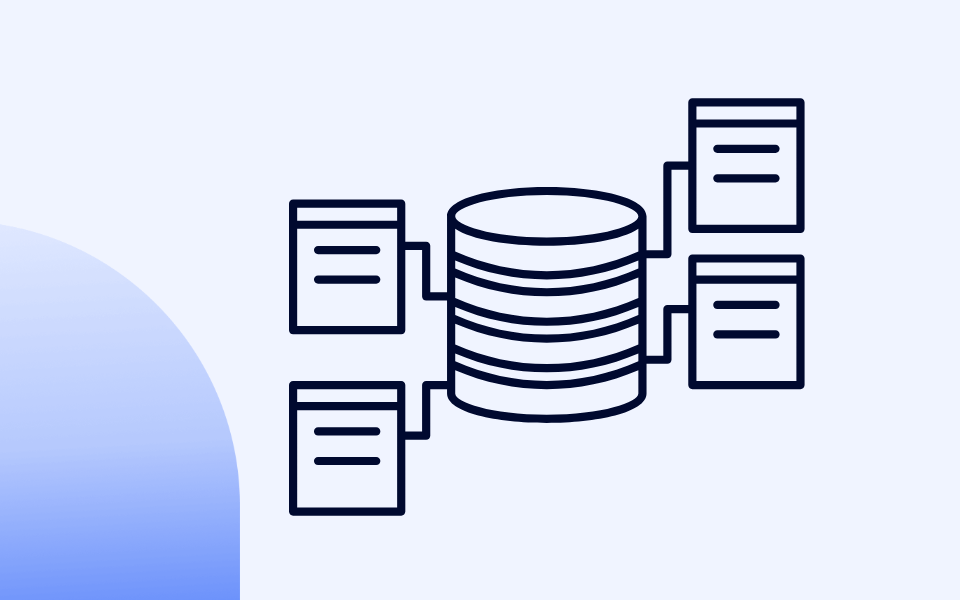
How HubSpot's Data Model Works
HubSpot organizes everything into objects — Contacts, Companies, Deals, Tickets, and any custom objects you've created. These objects are connected through associations.
A Contact can be associated with a Company. A Deal can be associated with one or more Contacts and one Company. A Ticket can be associated with a Contact and a Company.
These associations are the glue that makes cross-object reporting possible, but they also introduce logic that trips people up. The key concept: when you build a cross-object report,
HubSpot starts from your primary data source and follows association paths outward. Any record that doesn't have an association to the connected object gets excluded from the results.
Here's a concrete example. Say you want a report showing deal revenue broken down by contact source. You set Deals as your primary source and add Contacts as a secondary source.
The report will only include deals that have at least one associated contact. If your sales team has deals in the pipeline that aren't associated with a contact — maybe they were created manually or imported without contact links — those deals vanish from the report.
Your total revenue number is now lower than what your pipeline actually shows, and you'll spend an hour trying to figure out why.
Why Primary Source Changes Your Numbers
Consider this scenario: you have 100 deals, and 80 of those deals have associated contacts. Some deals have one associated contact, others have three.
If you set Deals as primary and Contacts as secondary, you'll see 80 deals (the 20 without contacts are excluded).
If you set Contacts as primary and Deals as secondary, you'll see the total count of contact-deal associations — which could be 150 if some deals have multiple contacts. Same underlying data, very different output, and both are technically "correct" depending on what question you're answering.
The rule is straightforward: your primary source should be the thing you're counting. If you want to know "how many deals," Deals is your primary source.
If you want to know "how many contacts are associated with deals," Contacts is your primary source. Getting this backward is the single most common custom reporting mistake in HubSpot.
Association Labels and Why They Matter
On Enterprise, HubSpot supports association labels — tags that describe the nature of a relationship between two objects.
For example, a Contact associated with a Deal might be labelled "Decision Maker," "Budget Holder," or "End User." A Contact associated with a Company might be "Primary Contact" or "Billing Contact."
These labels become reporting filters. If you're building a report on deal contacts and you only care about decision makers, you can filter by the "Decision Maker" association label.
Without this filter, your report includes every associated contact regardless of their role, which can inflate counts and muddy your analysis. If your team uses association labels consistently, they're a serious advantage in reporting.
If they don't, it's worth setting them up — the reporting payoff is significant.
When Custom Objects Change the Game
Standard objects cover most B2B scenarios, but there are cases where your business model doesn't fit neatly into Contacts, Companies, and Deals. Maybe you need to track partnerships, subscriptions, product installations, or project deliverables as first-class objects in your CRM.
Custom objects (Enterprise only) let you create new object types with their own properties and associations. From a reporting perspective, a custom object can be used as a primary or secondary data source in the Custom Report Builder, just like any standard object.
This means you can build reports that combine, say, your custom "Subscription" object with Contacts and Companies to show renewal rates by customer segment.
Without custom objects, you'd be trying to hack this together with deal properties and custom fields, and the reports would be fragile.
Datasets: Governed Reporting for Larger Teams
If you're on Enterprise and you have multiple teams building their own reports, datasets (accessed through Data Studio in the Data Hub) solve a real governance problem.
A dataset is a pre-built collection of fields from one or more objects, with calculated columns and filters already applied.
Your ops team builds the dataset — choosing which fields to include, creating formulas for metrics like monthly recurring revenue or customer lifetime value, and setting default filters.
Then marketing, sales, or service teams build their own reports from that dataset instead of from the raw CRM data.
The benefit is consistency. When five different people build reports from raw deal data, they make five slightly different decisions about filters, date ranges, and field definitions — and you end up with five reports that show five different revenue numbers.
When those same people build from a governed dataset, the foundational logic is locked in. They can still choose their own visualizations and add filters, but the base numbers match.
Datasets also let you create fields that don't exist as standard properties — year-over-year growth rates, rolling averages, or ratios between objects — all inside the dataset definition, without creating custom properties that clutter your CRM.
6. HubSpot Attribution Reporting — From First Touch to Revenue
Attribution is where HubSpot reporting gets genuinely hard — not because the tool is difficult to use, but because the concept itself requires careful thinking.
Attribution reporting answers the question "which marketing efforts contributed to this outcome?" and the answer changes depending on how you define "contributed."
This is an Enterprise-only feature across Marketing Hub and Content Hub. If you're on Professional, you can still track original source and campaign membership, but you won't have access to the multi-touch attribution models below.
The Three Attribution Report Types
HubSpot offers three distinct attribution reports, each tied to a different conversion event.
Contact Create Attribution looks backward from the moment a contact was created in your CRM and assigns credit to the marketing interactions that preceded it.
This answers "what's generating our leads?" If you're focused on top-of-funnel growth — filling the database with new names — this is your starting point.
Deal Create Attribution looks backward from the moment a deal was created and assigns credit to the marketing interactions that happened before that point.
This answers "what's generating our pipeline?" It goes a step further than contact creation because not every contact becomes an opportunity.
A channel might generate hundreds of contacts but very few deals — and this report surfaces that distinction. Available on Marketing Hub Enterprise only.
Revenue Attribution looks backward from closed-won deals and assigns credit to every marketing touchpoint that occurred across the entire customer journey.
This answers "what's making us money?" and it's the report your CFO cares about. Also Marketing Hub Enterprise only.
The Seven HubSpot Attribution Models Explained
Each report type above can use any of HubSpot's attribution models. The model determines how credit gets distributed across touchpoints.
| Attribution Model | Credit Distribution | Best For |
|---|---|---|
| First Interaction | 100% to the very first touchpoint | Understanding which channels fill the top of your funnel |
| Last Interaction | 100% to the final touchpoint before conversion | Identifying what tips people over the edge to convert |
| Linear | Equal credit to every touchpoint | A baseline view when you don't have a strong hypothesis |
| U-Shaped | 40% first touch, 40% lead creation, 20% middle | Teams focused on discovery-to-lead-capture motion |
| W-Shaped | 30% first, 30% lead creation, 30% deal creation, 10% middle | B2B companies where marketing influences deal creation |
| Full-Path | 22.5% each to first, lead, deal, and close; 10% middle | Long, complex sales cycles with marketing involved throughout |
| Time Decay | More credit to recent interactions, less to earlier ones | Shorter sales cycles where recent touches matter most |
How to Choose the Right Attribution Model
There's no universally correct model — the right one depends on your question and sales cycle.
If your sales cycle is short (under 30 days) and most contacts convert within a few interactions, First Interaction, Last Interaction, or Time Decay will give you clear signals. There aren't enough touchpoints for the multi-anchor models to add much value.
If your sales cycle is long (3–12 months) with many touchpoints across channels, W-Shaped or Full-Path will give you a more accurate picture. These models are designed for complexity.
If you're just getting started with attribution, begin with Linear. It's the least biased model and gives you a baseline to compare against. Once you see the data, you'll form opinions about which touchpoints matter more — and that's when you switch to a model that weights them accordingly.
Three Attribution Pitfalls to Watch For
Invisible touchpoints. Attribution can only credit interactions that HubSpot tracks. If a prospect hears about you on a podcast, mentions you to a colleague, and that colleague eventually visits your site and fills out a form — attribution credits the form fill. The podcast and the word-of-mouth are invisible. Keep that in mind before cutting budget to anything that looks low-performing.
Cross-model confusion. Don't compare attribution models side by side and try to average them. Each model tells a different story for a different purpose. Pick the model that matches your question, use it consistently, and compare results over time within the same model.
Dirty data. Attribution works best with clean data. If your CRM has contacts with incomplete activity histories, deals that aren't associated with the right contacts, or campaigns that aren't tagged correctly, your attribution numbers will be misleading. The data quality work in Section 8 is a prerequisite for attribution you can trust.
7. Reports Worth Building Across Every Hub
Now that you understand the report types, the builder, and the data model — here are the specific reports that earn their place on a dashboard. These are the ones that actually change how teams make decisions.
Marketing Reports
Campaign ROI by Channel
This is the report most marketing teams need and few actually build properly. Use the Custom Report Builder with Deals as the primary source and Campaigns as a secondary source.
Measure closed-won deal revenue, broken down by the campaign that influenced the deal. Filter to a rolling 6- or 12-month window.
The result tells you which channels are producing revenue — not just clicks or leads — and it's the foundation for any serious budget allocation conversation. On Enterprise, pair this with a revenue attribution report for a multi-touch view.
Lifecycle Stage Progression
Build a funnel report tracking contacts from Subscriber to Lead to MQL to SQL to Opportunity to Customer. This report exposes where your funnel leaks and how long contacts sit in each stage.
If contacts are piling up in MQL and never reaching SQL, that's either a lead quality problem or a handoff problem between marketing and sales — and this report makes the conversation specific.
Email Engagement Trends
Use a single object report on Marketing Emails, tracking open rate, click rate, and unsubscribe rate over time (grouped by month or quarter).
Don't just look at individual email performance — the trend matters. A slowly declining open rate over six months tells you something different than one bad email. Segment by email type (newsletter vs. nurture sequence vs. one-off send) to see which formats are wearing out.
Landing Page Conversion Analysis
Build a report measuring form submission rate by page, sorted by traffic volume.
A page with 5,000 monthly views and a 1% conversion rate is a bigger opportunity than a page with 50 views and a 10% rate.
Cross-reference your top-traffic, low-conversion pages with your top-converting pages to identify what the high performers do differently.
Sales Reports
Pipeline Health by Stage
Use the Custom Report Builder with Deals as the primary source. Show deal count and total deal value, broken down by deal stage.
Filter to open deals only (exclude closed-won and closed-lost). This is the report your sales leader should check every morning. If 70% of your pipeline value is stuck in one stage, you've found the bottleneck. Add a breakdown by deal owner to see if it's team-wide or rep-specific.
Deal Velocity — Time in Each Stage
Build a report measuring the average number of days deals spend in each pipeline stage. If your average deal takes 45 days to close and 20 of those days are in "Contract Sent," the problem isn't your prospecting or discovery calls — it's your contracting process.
This report turns vague concerns about slow deals into specific, fixable process issues.
Win/Loss Analysis by Source and Competitor
Take your closed deals (won and lost) and segment by original source and competitor involved.
If deals from partner referrals close at 60% and deals from paid search close at 15%, that's a signal about lead quality that should influence both marketing spend and sales prioritization.
Add Deal Lost Reason as a breakdown to see if patterns emerge — pricing, timing, feature gaps, or "went dark."
Lead Response Time
Measure the time between a contact becoming an MQL and the first sales activity logged.
Research consistently shows that responding within five minutes is dramatically more effective than waiting 30 — but most teams don't measure this and have no idea how long their reps actually take.
A simple bar chart showing average response time by rep makes the problem visible and creates accountability.
Service Reports
Ticket Resolution Time by Category
Use Tickets as your primary source. Measure average time to close, broken down by ticket category or pipeline. Filter out tickets closed immediately (often duplicates or tests) to avoid skewing the average.
If "billing issues" take three times longer to resolve than "product questions," that might indicate a process problem on the billing side rather than a support capacity issue.
Customer Satisfaction Over Time
If you're using HubSpot's feedback surveys (CSAT, NPS, or CES), build a trend report tracking scores over time. A single NPS score is a snapshot — the trend tells you whether your customer experience is improving or degrading.
Break it down by customer segment or support rep to find where satisfaction is highest and lowest.
SLA Compliance
Track the percentage of tickets resolved within your SLA window using ticket properties like "time to first response" and "time to close."
This is especially important for B2B companies where SLA compliance is contractual. Set up a scheduled email alert when compliance drops below your target so the team catches problems early.
8. Operations and Data Quality Reports
Every report in this guide depends on one thing: clean data. Attribution models, deal velocity calculations, lifecycle funnels — they all produce misleading numbers if the underlying CRM data is incomplete, duplicated, or inconsistently formatted.
Operations reporting isn't the exciting part of HubSpot, but it's the part that determines whether everything else is trustworthy.
Build a Data Quality Dashboard
HubSpot's Data Hub (formerly Operations Hub) includes built-in data quality tools that flag duplicate records, missing property values, and formatting inconsistencies. But the tool only helps if someone is watching it.
Build a dedicated Data Quality Dashboard with reports that track CRM health over time. The goal isn't a one-time cleanup — it's ongoing visibility so problems get caught early instead of compounding for months. At a minimum, include reports on duplicate records, property fill rates, and workflow errors.
Property Fill Rate Reports
This is one of the most useful and underbuilt reports in HubSpot. Pick the properties that matter most to your reporting and automation — lifecycle stage, lead source, deal amount, close date, company industry — and build a report showing what percentage of records have those fields populated.
Use a single object report. Add the property as a filter set to "is known" vs. "is unknown" and track the ratio. If only 60% of your deals have a populated "deal lost reason," your win/loss analysis is based on incomplete data. If 30% of contacts are missing a lifecycle stage, your funnel report has a hole in it.
These reports make the invisible problem visible. They also create accountability — when a sales manager sees that their team is leaving deal amount blank on 40% of records, the conversation shifts from "we should fill that in" to "here's the data showing we're not doing it."
CRM Adoption Reports
Build a report tracking how actively your team engages with HubSpot. Useful metrics: number of activities logged per rep per week (calls, emails, meetings, notes), records created or updated, and last activity date per user.
This doesn't need to be a policing exercise. The purpose is to spot adoption problems early. If a new rep's activity volume drops after their second week, that's a training issue.
If an entire team stops logging calls after a process change, the new process isn't working. Without this report, these patterns stay hidden until someone notices the data is stale — usually when a report looks wrong in a quarterly review.
Workflow Health and Sync Errors
If you're running automated workflows — lead routing, lifecycle stage changes, task creation — you need a report monitoring their success and failure rates.
HubSpot shows workflow errors in the workflow tool, but most people only check when something visibly breaks. By then, a workflow might have been silently failing for weeks.
Review workflow error logs weekly and create a dashboard tile showing error counts for your most critical workflows.
If you're using Data Hub's data sync to connect HubSpot with other systems, add sync error monitoring to the same dashboard. A sync that fails overnight means your team spends the next day working with stale data — and they won't know it unless someone is watching.
9. HubSpot Dashboards That Actually Get Used
A dashboard that nobody opens is worse than no dashboard at all — it creates the illusion that reporting is handled when it isn't.
The difference between a dashboard that gets checked every morning and one that gets forgotten after the first week comes down to three things: who it's built for, what's on it, and how much is on it.
The most common dashboard mistake is building one view for everyone.
A CMO, a sales manager, and an individual rep need fundamentally different information. When you try to serve all three on the same dashboard, you end up with 25 reports that nobody can parse.
Executive dashboards should have 4–6 high-level KPI cards and trend lines: total pipeline value, revenue closed vs. target, marketing-sourced pipeline percentage, customer churn rate. No granularity, no rep-level breakdowns — just the numbers that answer "are we on track?"
Manager dashboards need more detail: pipeline by stage, deal velocity, rep activity comparison, lead response time, forecast accuracy. This is the dashboard that drives weekly team meetings and one-on-ones. Specific enough to identify which reps need coaching and which deals need attention.
Individual rep dashboards should be the simplest: their open deals by stage, activity count this week, quota attainment, and upcoming tasks. Fewer distractions, more focus. A rep doesn't need company-wide churn rates at 8am — they need to see which deals to work today.
Choose the Right Visualization
Use KPI cards for single numbers that matter on their own: total revenue this quarter, open ticket count, average deal size. Line charts for trends over time: email engagement, ticket volume, pipeline growth.
Bar charts for comparisons across categories: revenue by source, deals by rep, tickets by type. Tables when stakeholders need to drill into specific records. And pie or donut charts sparingly — they're hard to read with more than four or five segments, and a horizontal bar chart almost always communicates the same information more clearly.
HubSpot lets you put up to 30 reports on a single dashboard.
That doesn't mean you should. A dashboard with 30 tiles looks impressive in a screenshot and is useless in practice — the eye doesn't know where to go, and important signals get buried.
Aim for 6–10 reports per dashboard. If you can't fit everything in that range, split into two: one for daily check-in metrics and one for deeper monthly review.
Give them clear names — "Sales: Daily Pipeline View" and "Sales: Monthly Performance Review" — so people know which one to open and when.
Embedding External Content on a Dashboard
Your reporting doesn't have to live entirely inside HubSpot's report builder. On Professional and Enterprise, you can embed external content directly onto a dashboard — Google Sheets charts, Google Slides presentations, video content, or embeds from other platforms.
To add external content, open your dashboard and click "Add content," then select "External content." Choose from HubSpot's recommended sources or paste a URL or embed code from another platform. Embedded content counts toward your dashboard item limit but doesn't count against your custom report limit.
A practical example: if your finance team maintains a revenue forecast in Google Sheets, embed that chart on your executive dashboard alongside HubSpot's pipeline forecast.
Now leadership sees both views in one place. You can even connect a HubSpot workflow to a Google Sheet — automatically adding a row when a deal closes — so the embedded chart stays current without manual updates.
HubSpot also lets you set dashboard visibility to "private" (just you), "specific users and teams," or "everyone." Match the visibility to the audience — rep dashboards should be visible to the rep and their manager, not the entire company.
For stakeholders who won't log in regularly, set up scheduled email delivery. You can configure any dashboard to send a summary email daily, weekly, or monthly.
This is especially useful for executives and board members who want the numbers without navigating the platform. The email includes a snapshot of each report with a link to the live version for anyone who wants to dig deeper.
10. Common HubSpot Reporting Mistakes and How to Avoid Them
Even well-intentioned teams make the same reporting mistakes repeatedly. Most aren't about chart types or colors — they're structural problems that undermine trust in the data.
1. Reporting on Vanity Metrics
It's easy to build a dashboard full of numbers that go up and to the right but don't inform decisions. Total website visits, raw contact count, number of emails sent — these feel good to report but don't tell you whether anything is working.
Every report on your dashboard should pass a simple test: "If this number changed significantly, would we do something different?" If the answer is no, the report doesn't belong there. Replace vanity metrics with leading indicators that connect to revenue — conversion rates between stages, pipeline velocity, cost per opportunity, time to close.
2. Building Reports Before Cleaning Data
This is the most expensive mistake because it wastes time twice — once building the report, and again explaining why the numbers don't match reality. If 30% of your deals are missing an amount, your revenue report is understated by roughly a third. If contacts have duplicates, your funnel double-counts people at different stages.
Clean the data first. Or at minimum, build the data quality reports from Section 8 first so you understand the gaps before presenting numbers to stakeholders.
3. Picking the Wrong Primary Data Source
We covered this in Sections 4 and 5, but it's worth repeating because it's the most common technical mistake in the Custom Report Builder. Before saving any cross-object report, ask yourself: "What am I counting?" Then confirm the primary source matches that answer.
4. Ignoring Association Gaps
Cross-object reports silently exclude records that lack the required associations. If 15% of your deals don't have an associated contact, those deals disappear from any deal-to-contact report without warning.
Build the habit of comparing your report totals against a simple single-object report. If your cross-object deal report shows $2M in pipeline but a basic deal report shows $2.3M, the $300K difference is likely unassociated records. Fix the associations or add a note to the dashboard explaining the gap.
5. Overloading Dashboards
The urge to add "just one more report" is strong, especially during quarterly planning when everyone has a metric they want to see. Before long, you have a 25-tile dashboard where nothing stands out.
If someone asks to add a tile, ask what it replaces. A dashboard with a fixed capacity forces prioritization, and prioritization is what makes reporting useful.
6. Setting and Forgetting
Reports aren't infrastructure you build once and walk away from. Your business changes — new products, new markets, new pipeline stages. Reports built for last year's process produce misleading results this year if they aren't updated.
Schedule a quarterly reporting review. Walk through every dashboard, confirm filters still make sense, check the data is clean, and remove reports nobody has looked at in the past 90 days. This takes a couple of hours per quarter and prevents the slow rot that turns a useful reporting setup into a graveyard of outdated charts.
11. When Native HubSpot Reporting Isn't Enough
HubSpot's reporting has improved dramatically over the past few years, but it still has limits. Being honest about those limits is more useful than pretending they don't exist.
The most common limitation is reporting across more than two levels of association. The Custom Report Builder handles two-object joins well, but combining three or four objects with complex logic gets difficult.
A report like "revenue by contact source, broken down by product line item, filtered by company industry" is three objects deep, and the builder may not produce the output you expect.
Another frustration is historical reporting. HubSpot reports on current property values by default.
If a deal is in "Closed Won" now but you want to know what stage it was in on March 1st, standard reports can't answer that. The Historical Snapshot report provides some of this, but it's limited to preset views.
Calculated fields in the report builder are useful but limited compared to a spreadsheet or BI tool. Basic math works — sums, averages, ratios — but conditional logic, nested formulas, and cross-row calculations aren't supported.
Finally, the visual layer. HubSpot's chart types cover the basics, but advanced visualizations — scatter plots with regression lines, heat maps, cohort tables, multi-axis charts — aren't available in the native builder.
Before reaching for external solutions, there are several ways to push the boundaries.
Calculated properties let you compute values at the object level that you can then use in any report. If you need a "days since last activity" metric, create a calculated property on the Contact object. Available on Professional and above.
Custom coded workflow actions (Data Hub Professional and above) let you run JavaScript inside a workflow. You can compute complex values, pull data from external APIs, and write results back to HubSpot properties — which then become reportable. If you need conditional logic or external data in a property, this is how you build it without leaving the platform.
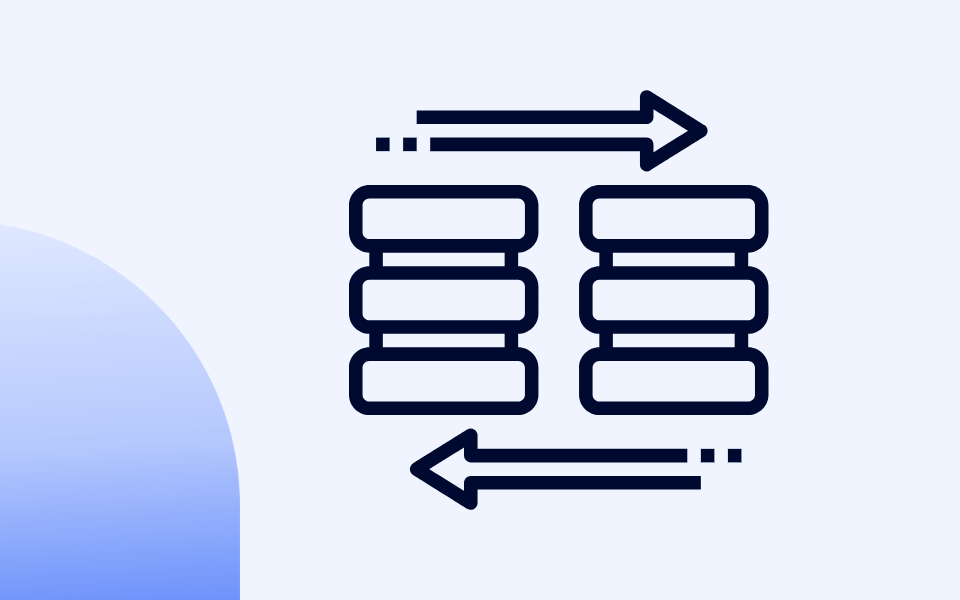
Data Hub sync and formatting keeps your HubSpot data aligned with other systems. If part of the data you need lives in a billing system or product database, Data Hub's two-way sync can bring it into HubSpot so you can report on it natively.
For organizations that have outgrown HubSpot's reporting entirely — typically companies with complex multi-product revenue models, large data volumes, or requirements spanning multiple systems — the next step is a data warehouse.
The approach: extract data from HubSpot (and your other systems) into a central warehouse, transform it into reporting-ready tables, and connect a BI tool to visualize it. HubSpot's API provides access to all standard and custom objects, properties, and activity data. Data Hub's Reverse ETL feature (Enterprise) can also push data from HubSpot into external systems.
This is a significant investment. But if you're spending hours each week exporting CSVs from HubSpot, joining them manually in spreadsheets, and building presentations from the results — that's a signal you've outgrown native reporting and the time cost of a warehouse build would pay for itself.
If your reporting question can be answered by a single HubSpot report with the right filters, solve it there. If it requires combining two objects with a calculated field, use the Custom Report Builder with datasets or calculated properties. If it requires data from multiple systems, conditional logic beyond basic formulas, or historical point-in-time analysis — that's when you evaluate a warehouse.
Most companies in the SMB and mid-market range get 80–90% of what they need from HubSpot's native reporting on Professional or Enterprise. The last 10–20% is where you decide whether the insight is worth the infrastructure.
12. Where to Start
HubSpot's reporting is only as good as the thinking behind it. The platform gives you the tools — custom report builders, attribution models, dashboards, datasets — but the value comes from connecting those tools to the right questions.
Start with clean data. If your CRM is full of duplicates, missing fields, and unassociated records, every report you build on top of it will be off. The data quality reports aren't optional — they're the foundation.
Match the report type to the question. Single object reports for simple counts, the Custom Report Builder for cross-object analysis, funnels for stage conversion, attribution for marketing's impact on revenue. Picking the right type saves you from fighting the tool.
Build dashboards for people, not for completeness. An executive needs five tiles. A manager needs ten. A rep needs four. If every dashboard has 25 reports, nobody is looking at any of them.
Revisit your reporting regularly. The quarterly review habit — checking filters, cleaning up unused reports, updating for process changes — separates teams that trust their data from teams that export everything to a spreadsheet because they don't.
If you're just getting started, pick the section of this guide that matches your most urgent gap — pipeline visibility, attribution, data quality, whatever keeps coming up in your team meetings — and build those reports first. You don't need to implement everything at once. You need a handful of reports your team actually opens every day.
Frequently Asked Questions About HubSpot Reporting
What HubSpot subscription do I need for custom reports? You need HubSpot Professional or above to access the Custom Report Builder and create cross-object reports. Free and Starter plans are limited to single-object reports and up to 10 dashboards. Enterprise unlocks calculated fields, datasets, and attribution reporting.
What's the difference between a HubSpot report and a dashboard? A report is a single data visualization — a chart, table, or KPI card that answers a specific question. A dashboard is a collection of reports arranged on one screen. Dashboards don't generate data; they organize reports into a view designed for a specific audience.
How does HubSpot attribution reporting work? Attribution reports work backward from a conversion event (contact creation, deal creation, or closed-won deal) and assign credit to the marketing touchpoints that preceded it. HubSpot offers seven attribution models — from First Interaction (100% credit to the first touchpoint) to Full-Path (credit distributed across first touch, lead creation, deal creation, and close). Attribution is an Enterprise-only feature.
Why do my HubSpot report numbers not match my pipeline? The most common cause is association gaps. Cross-object reports exclude records that lack the required associations. If you join Deals to Contacts and some deals don't have associated contacts, those deals are silently dropped from the results. Compare your report against a single-object report to spot the difference.
How often should I review my HubSpot dashboards and reports? Schedule a quarterly reporting review to confirm filters are current, data is clean, and unused reports are removed. Individual dashboards should be checked as frequently as the decisions they inform — daily for pipeline dashboards, weekly for team performance, monthly for executive views.
Can I embed external content in a HubSpot dashboard? Yes, on Professional and Enterprise. You can embed Google Sheets, Google Slides, videos, and other content by clicking "Add content" > "External content" on any dashboard. Embedded items count toward your dashboard item limit but not your custom report limit.
Share: